Case Study done for Roommate Finder App (Project)
Define the Problem:
Users struggle to find roommates who match their lifestyle, habits, and expectations.
Problem statement:
“Young adults need a better way to evaluate roommate compatibility before moving in together because current platforms focus heavily on listings and not enough on lifestyle fit.”
Ideate:
Brainstorming possible solutions.
Ideas:
Compatibility quiz
Detailed lifestyle profiles
Filters for cleanliness, sleep schedule, pets, smoking, guests
Match percentage
In-app messaging
Verified profiles
Roommate preference checklist
Prioritize ideas:
Deciding what should go into the first version.
MVP:
Create profile
Set roommate preferences
Browse potential roommates
View detailed profiles
Send messages
Create the User Flow:
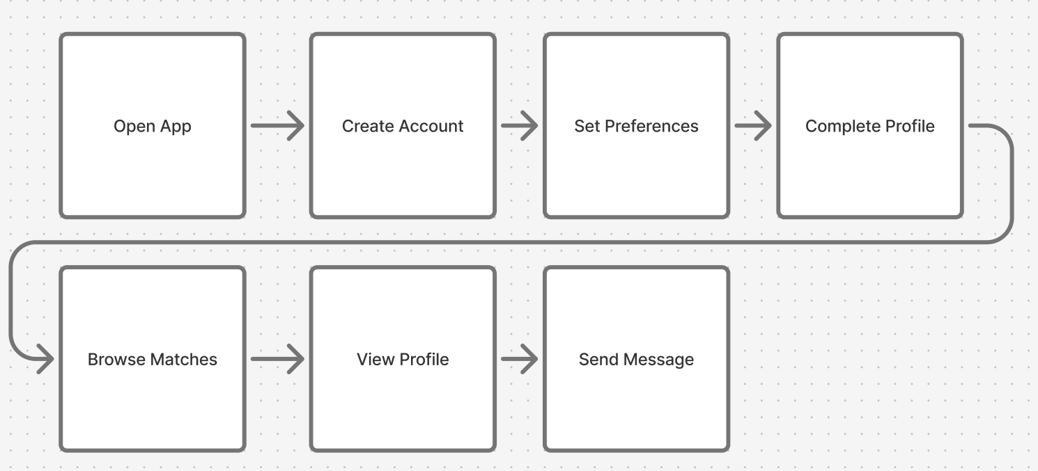
Using Figma’s FigJam, I created a user flow.
I decided that the simples user flow for the MVP would be
Open app > Create account > Complete profile > Set preferences > Browse matches > View profile > Send message
Information Architecture:
Based on the user the flow, I created how the app should be organized
Navigation:
Home
Suggested matches
Search
Filters
Results
Messages
Conversations
Profile
About me
Lifestyle
Preferences
Account settings
Low-Fidelity Wireframes:
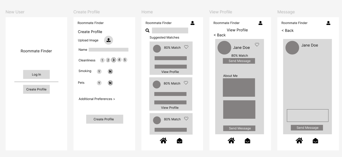
Using the user flow and architecture, I constructed low fidelity wireframes to meet the user needs, from account creation to messaging.
Testing and Feedback:
I showed the wire frame to a potential user and received the following feedback:
“What if I’m ok with a vape-user but not a smoker? Can we incorporate a setting like that?”
“What if I want to search by gender for a roommate?”
“I like dogs but I’m allergic to cats.”
Iteration:
Incorporating the feedback from the user, I added the updates to the high-fidelity mockup.
Visual Design:
Now that I had the feedback updated, I set out creating a visual design for the final mockup.
High Fidelity Mockup:
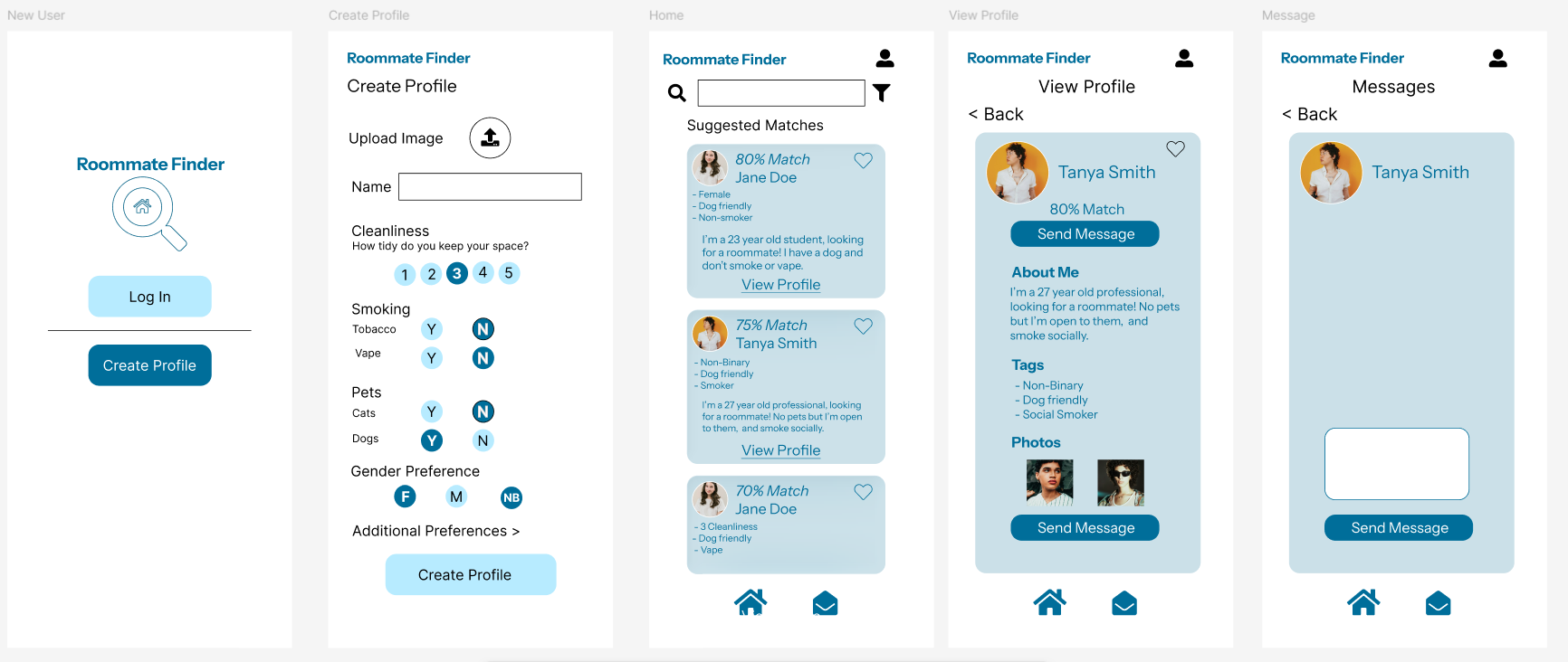
Incorporating both the feedback and visual design, I created the final mockup.
I added a more robust profile creation per the feedback.
I added images and selected a consistent font and color theme to be used throughout the mockup.
Prototyping:
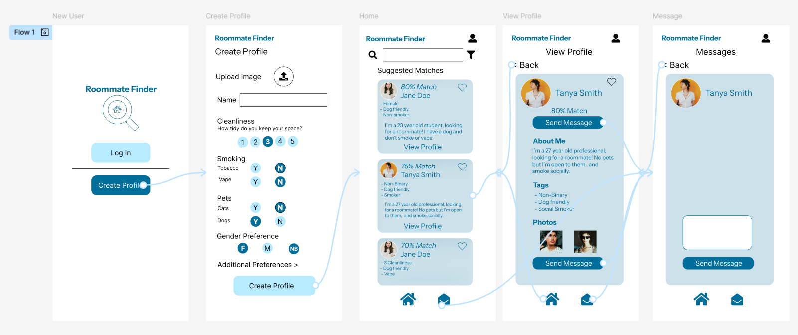
Using Figma, I added interactive features to the prototype, allowing the tester to use buttons to navigate the user flow and also navigate to previous pages.
In conclusion:
I would test the final mockup and prototype and continue iterating where we need to to improve the user experience. Overall I feel this project was helpful in helping me understand user needs are sometimes very specific and incorporating user feedback is the ultimate job of a designer when creating a functional and personal piece of technology.